|
|
Post by Billy on Dec 31, 2009 2:02:49 GMT -6
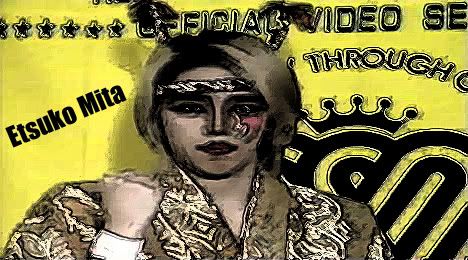
The silver is fine, but maybe do something about how grainey her face looks...
|
|
|
|
Post by Stevie on Dec 31, 2009 2:12:02 GMT -6
While the Cyberdyne Systems design actually made me step back and say "Wow", the colour version just doesn't have the same impact.
So it's the Silver Machine for me all the way.
|
|
|
|
Post by scarletspider on Dec 31, 2009 4:52:13 GMT -6
I prefers the second one meself. The silver one is alright but Melissa sort of fades into the background in that one, the image is overwhelmed by the effect. The colour one makes Melissa stand out more, and gives the image a lot more impact. Just like the real Melissa.  |
|
|
|
Post by profchaos on Dec 31, 2009 5:25:25 GMT -6
I really like the silver one but I'm worried it will look diluted or blurred when printed out thus making it look cheap. If you can keep the good look, in fact maybe sharpen it up a bit then it's a great unique look that stands out and suits Melissa but if not at least you can see her cool eye make up and know that it will look like a quality product.
|
|
|
|
Post by blazermaniac5 on Dec 31, 2009 9:52:32 GMT -6
I like the silver color myself. The silver color makes it look a little different from other covers. Besides, Melissa is on the cover. That alone, is plenty good enough for me.
|
|
Deleted
Deleted Member
Posts: 0
|
Post by Deleted on Dec 31, 2009 10:52:25 GMT -6
Original without a doubt. Not to say that there's anything wrong with the second one, the first is just head and shoulders better.
|
|
|
|
Post by JSMwrestling on Dec 31, 2009 11:49:21 GMT -6
I prefer the second one too.
|
|
|
|
Post by xtasisguy on Dec 31, 2009 12:28:00 GMT -6
Think I actually might prefer the second one. Something about the first one just doesn't jive quite as well, although it's great too. Disc art's awesome, back is fantastic. You've done well, Shimmer Vol. 26 Art Department.
|
|
|
|
Post by Woo on Dec 31, 2009 12:37:51 GMT -6
Probably the coloured one as I am worried what the silver one will look like when printed. The first one is more artistic, but perhaps some people just won't get it.
I say go with the first one and take the risk.
|
|
|
|
Post by theeb on Dec 31, 2009 14:20:06 GMT -6
Hm i personally like both if you ask me, But i would say the second one.
|
|
|
|
Post by devero57 on Dec 31, 2009 14:35:51 GMT -6
I just think the Color Picture, #2, Looks better. The Terminator One just looks like a Black and White Picture.
|
|
|
|
Post by SirRobin on Dec 31, 2009 18:05:23 GMT -6
I prefer without the silver actually. Don't know why, I just like the colors
|
|
|
|
Post by LardWarriorELPS on Jan 1, 2010 9:53:28 GMT -6
I'm actually not the biggest fan of the picture itself. I would have preferred it be:  or 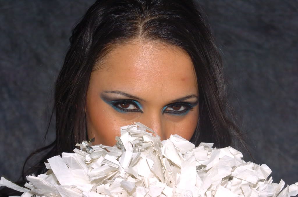 |
|
|
|
Post by haysihawk on Jan 1, 2010 12:13:03 GMT -6
I'm actually not the biggest fan of the picture itself. I would have preferred it be: That's flattering. That's from another day/match when she wore blue. If you haven't noticed, the SHIMMER DVD artwork always uses photos taken just before, during, or after the match on that particular DVD. |
|
|
|
Post by gcwphotoguy on Jan 1, 2010 12:56:55 GMT -6
My initial reaction was the second one because of the vivid color standout but I think the silver one is growing on me when i look at the them together. Plus it's unique and just seems to fit her. So, my vote is for silver although long run , it won't matter to me cause I'll buy it either way.
|
|