|
|
Post by SHIMMER office on Jul 2, 2009 20:11:25 GMT -6
JULY 5TH EDIT: Option #2 below, with the dark background, has been selected as the cover we will be using for Volume 23. The other versions we polled the board about are still below for everyone to check out. 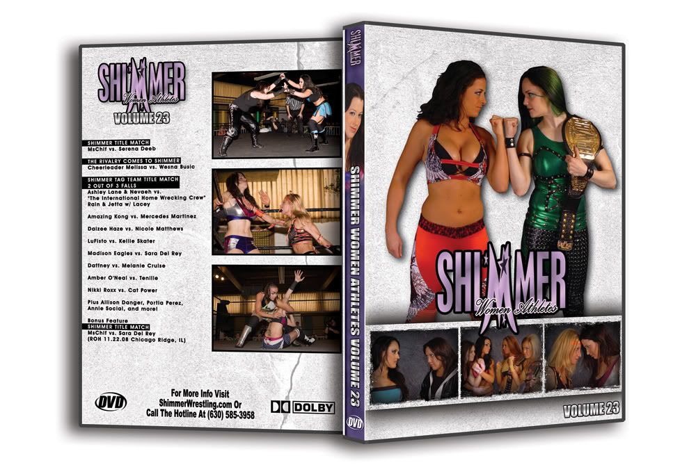 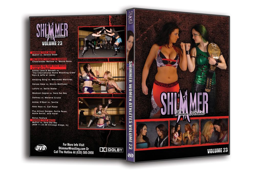 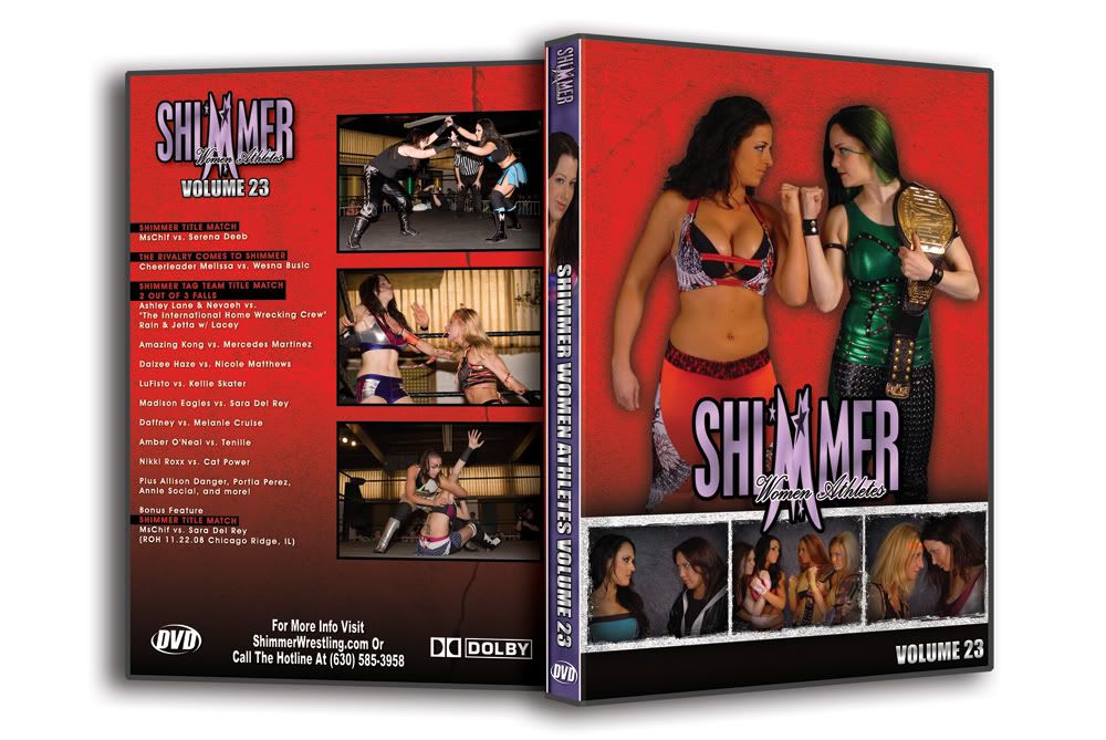
|
|
|
|
Post by SirRobin on Jul 2, 2009 20:46:44 GMT -6
I prefer the dark background
|
|
|
|
Post by NJ_ on Jul 2, 2009 21:01:00 GMT -6
I pick the second one.
|
|
|
|
Post by Ryan on Jul 2, 2009 21:04:41 GMT -6
I would go with number two. Number one just looks . . . blank.
|
|
|
|
Post by blazermaniac5 on Jul 2, 2009 21:18:08 GMT -6
I like number two as well.
|
|
|
|
Post by Todd Ingram on Jul 2, 2009 21:18:48 GMT -6
#2
|
|
|
|
Post by annoying on Jul 2, 2009 21:39:10 GMT -6
i like #1
|
|
|
|
Post by Digestive Ceremony on Jul 2, 2009 21:40:51 GMT -6
Number two. The red (#3) is just too much, too bright and distracting. The first one has that "snow screen" affect when your cable goes out.
|
|
|
|
Post by start.the.infeKKtion. on Jul 2, 2009 21:47:46 GMT -6
the 3rd one.
It matches with Serena's gear.
|
|
|
|
Post by hawkeye on Jul 2, 2009 21:47:48 GMT -6
Have to be a joiner on this one. #2.
|
|
Deleted
Deleted Member
Posts: 0
|
Post by Deleted on Jul 2, 2009 21:48:57 GMT -6
#2
|
|
|
|
Post by tee on Jul 2, 2009 21:50:15 GMT -6
#2 is the clear winner.
|
|
|
|
Post by SHIMMER office on Jul 2, 2009 21:53:52 GMT -6
the 3rd one. It matches with Serena's gear. The thing I don't like is how bright it winds up being overall, in combination with the green on MsChif. #2 basically "matches" Serena's gear as well... the background almost matches her waistband, and the border shade of red matches the rest. |
|
|
|
Post by Starscream on Jul 2, 2009 21:58:22 GMT -6
#1 has contrast and makes the wrestlers stand out a bit more, I like it the most but #2 matches Serena.
|
|
|
|
Post by Lacey and Rain Fan on Jul 2, 2009 22:01:58 GMT -6
I would go with number two.
|
|